Welcome to the second day of September Sketches! This is, again, another tutorial that isn't really a tutorial of a jumping horse. This is another pose I've practiced so much that I can practically draw it in my sleep! ...Okay, not really... Mm, and I adjusted the gamma correction again on this one to darken the lines. Really, my scanner does a terrible job of, well, scanning.
Here's the text on the picture, starting with the text under "September 2, 2011," and continuing clockwise.
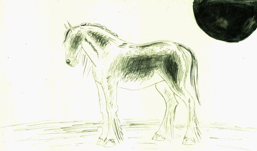
1. Today, I drew a jumping horse. The pose, I've found, is fairly simple to draw and adjust to the diff. jumping phases. In this drawing, you can see the position of the guide circles as opposed to the basic kidney bean.
2. Notice the circles are slightly squished, because the body is elongated.
3. Mercia Dragonslayer (My drawing again, folks! Couldn't have guessed it!)
4. I ignore the hoof/shoulder/leg correlation here--I just draw an angle that looks right.
5. I adjusted the head and nose, distinguishing them and making them more realistic rather than "cartoonish." (This sounds funny. I didn't adjust the head and nose as I drew them--I adjusted them from yesterday's picture. Yesterday's didn't have the same amount of detail and was basically two circles with two lines. I added the dips and curves you would see on a real horse's face.)
6. The mane is still light, but now flowing. Don't make it too dark!
7. Same for the tail.
I didn't add in the note at the bottom in order, because it pertains to the picture as a whole.
8. Remember, the horse is moving in this picture. You must keep him relaxed and free-flowing. (I.E., don't make him all straight lines and cubes. Let your wrist flow from one shape to the next. Use plenty of curves.)
Please comment and tell me if any of those directions were unclear or confusing, and I'll do my best to be better in the future.
Yesterday, I told you to practice, practice, practice, and you'll eventually get better. This statement is completely true, but there is also another element--observing. Go out to a farm and watch a horse. See how he moves, how he stands, how he acts. Observe the way his legs bend and how his hooves are angled. This will help you better draw him later on.
~Mercia Dragonslayer